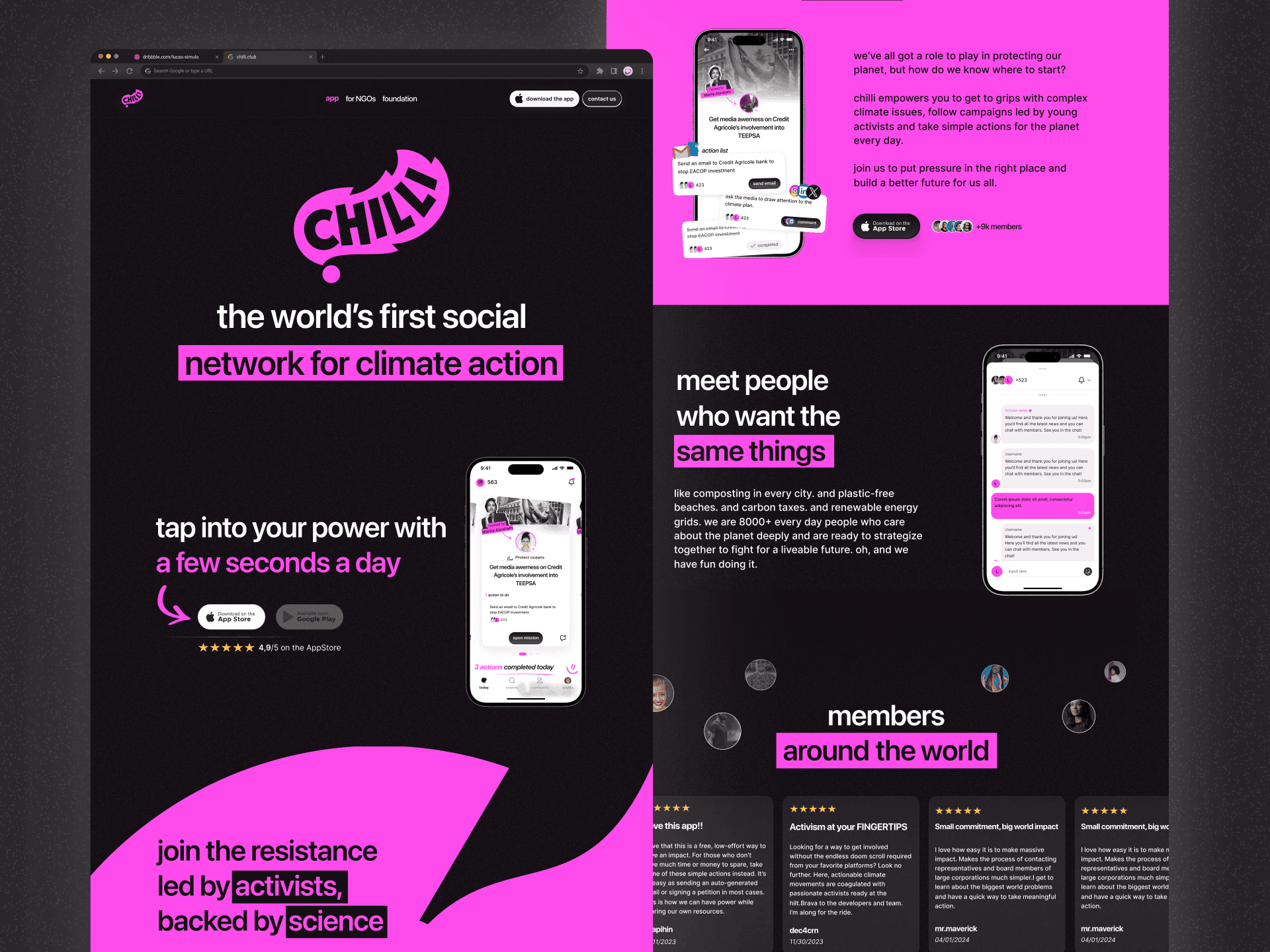
Chilli
The world's first climate activism app
I am directly responsible for the design of the mobile application (IOS). I worked on this project from early concept (MVP) to the current live version. Getting to this solution requires strategic planning, research, cross-functional collaboration, testing, and lot of prototyping which I won't discuss publicly.
Understanding the product
Introduction
The planet is warming up, that's a fact. As citizens, we are taking action in our daily lives to reduce our impact: sorting waste, cycling, walking instead of driving, flying less, taking shorter showers, etc... However, these micro actions have very little impact compared to the damage caused by the world's major industries. These companies destroy forests, pollute oceans and contaminate populations to create ever more wealth. To combat these acts, people called activists are waging battles to stop the design of these projects, financed by governments, banks and corporations.
The situation
These activists created what we call campaigns. Each campaign has a "stop carbon bomb" theme, for example, and carries out missions to stop projects. Field rallies, demonstrations, cyber-attacks: activists use a variety of tools to wage their war. However, for each new battle, they start from scratch:
Determining targets
Create actions
Gather information
Design the community
Communicate
Chilli
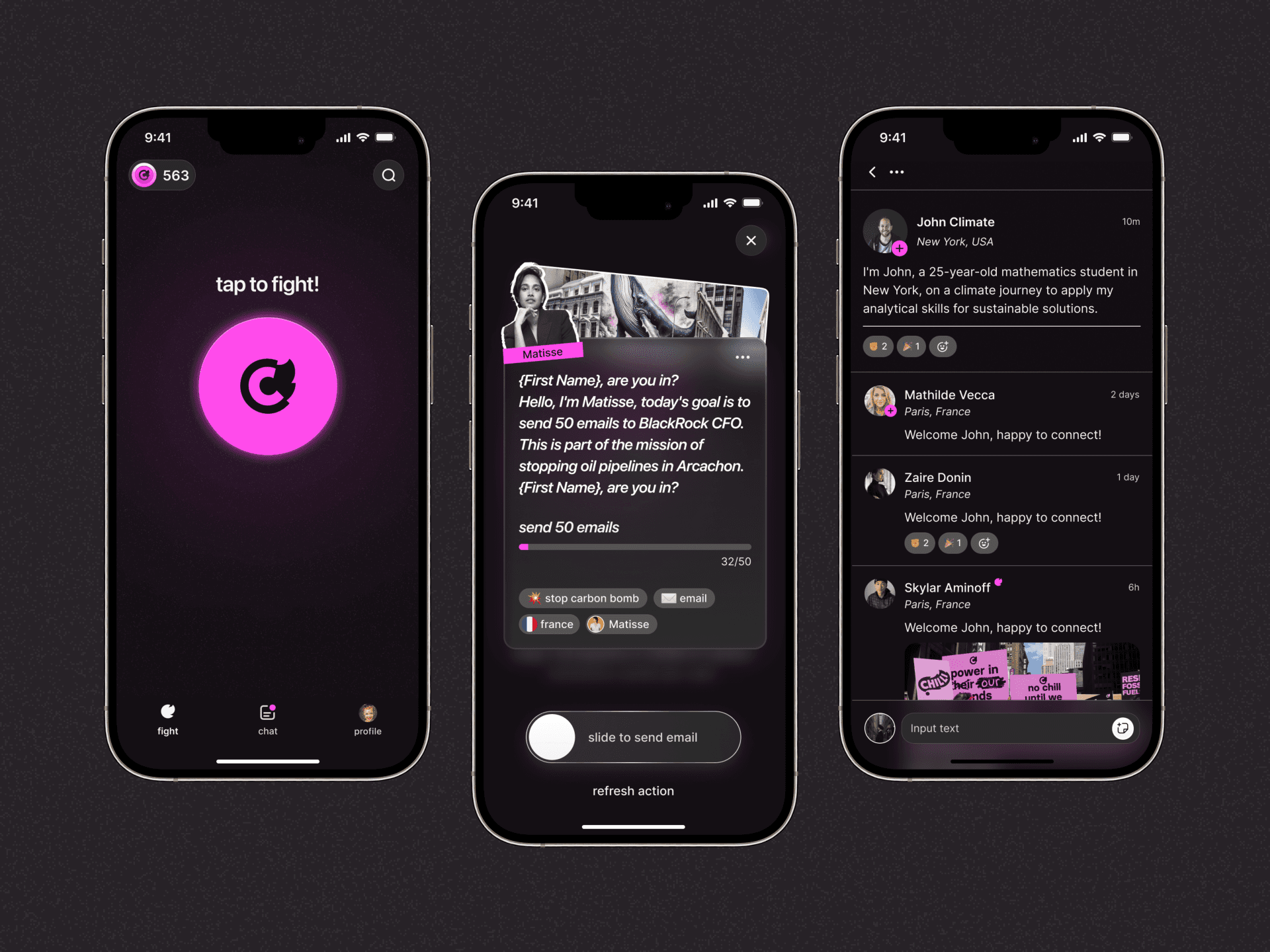
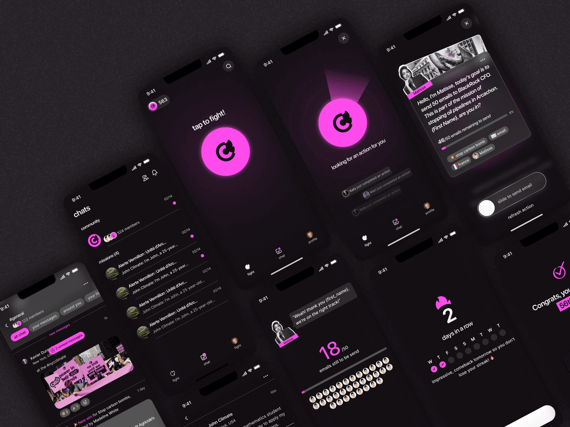
Now they have Chilli – a mobile application that lets users take digital action from the comfort of their sofa. Activists create missions on the platform, and thousands of users take part in these missions from their mobile.
UX challenges
Understand users needs
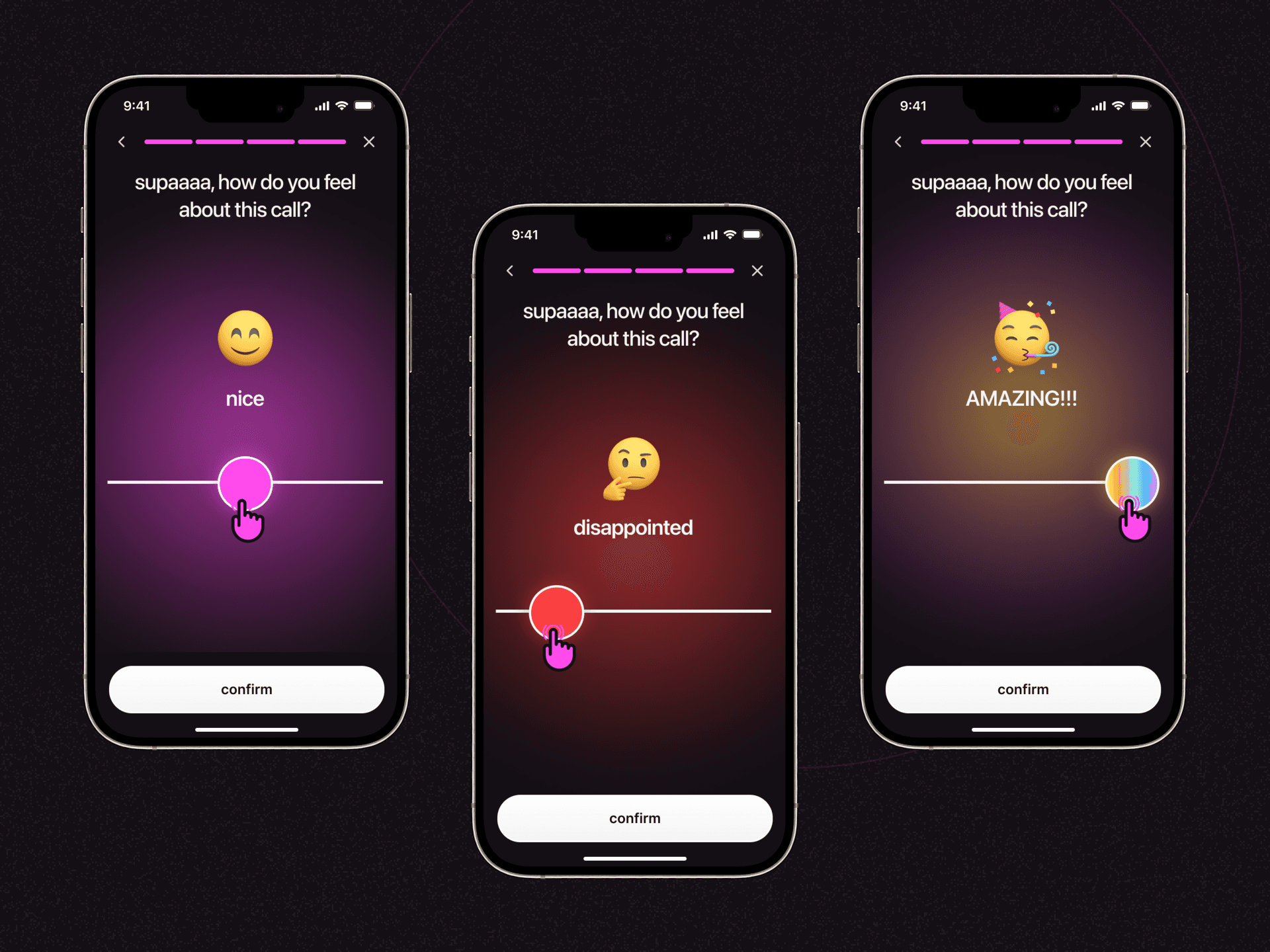
Users are more or less committed, depending on their level of investment, and are willing to invest time in actions. chilli's aim is to make activism accessible to all, and to show that online actions can have a real impact. Our aim is to simplify access to these actions as much as possible, while offering a minimum of information for taking action.
Our method
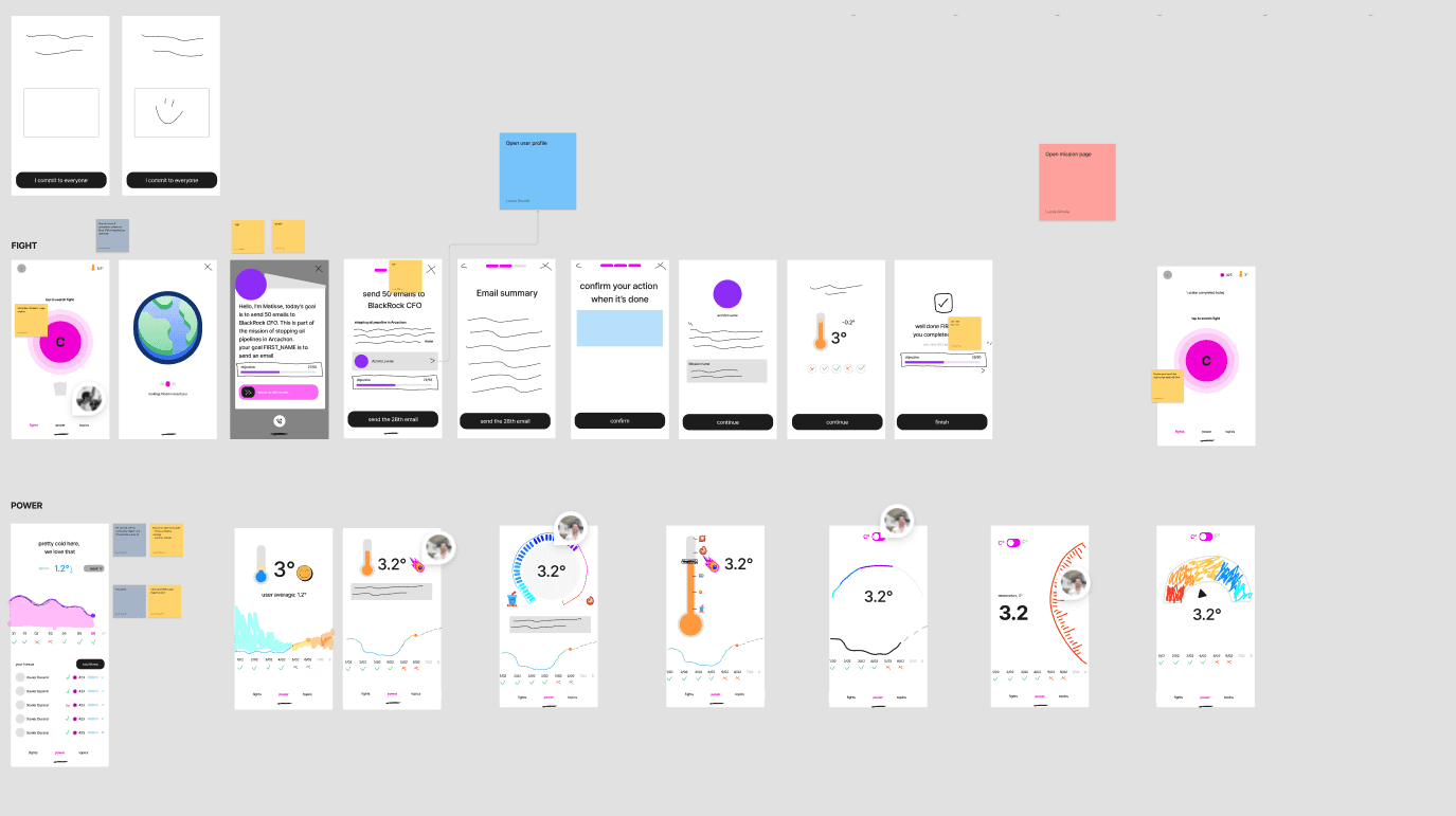
We created several versions of the application before finding one that worked. To do this, we iterate on solutions and listen to our users:
Interview to determine needs
Design priorities
Design and production
Repeat
About design
As the sole designer, I was in charge of 100% of the design, from user flow to final rendering. Using the data collected, the product team and I decided on a project with a timeline of 1 month for production launch, with the aim of iterating as quickly as possible.
My process :
Determining the feature
Benchmark
Design user flows
Mock-up design lo-fi
Review
Design of hi-fi mock-ups
Review
Production launch
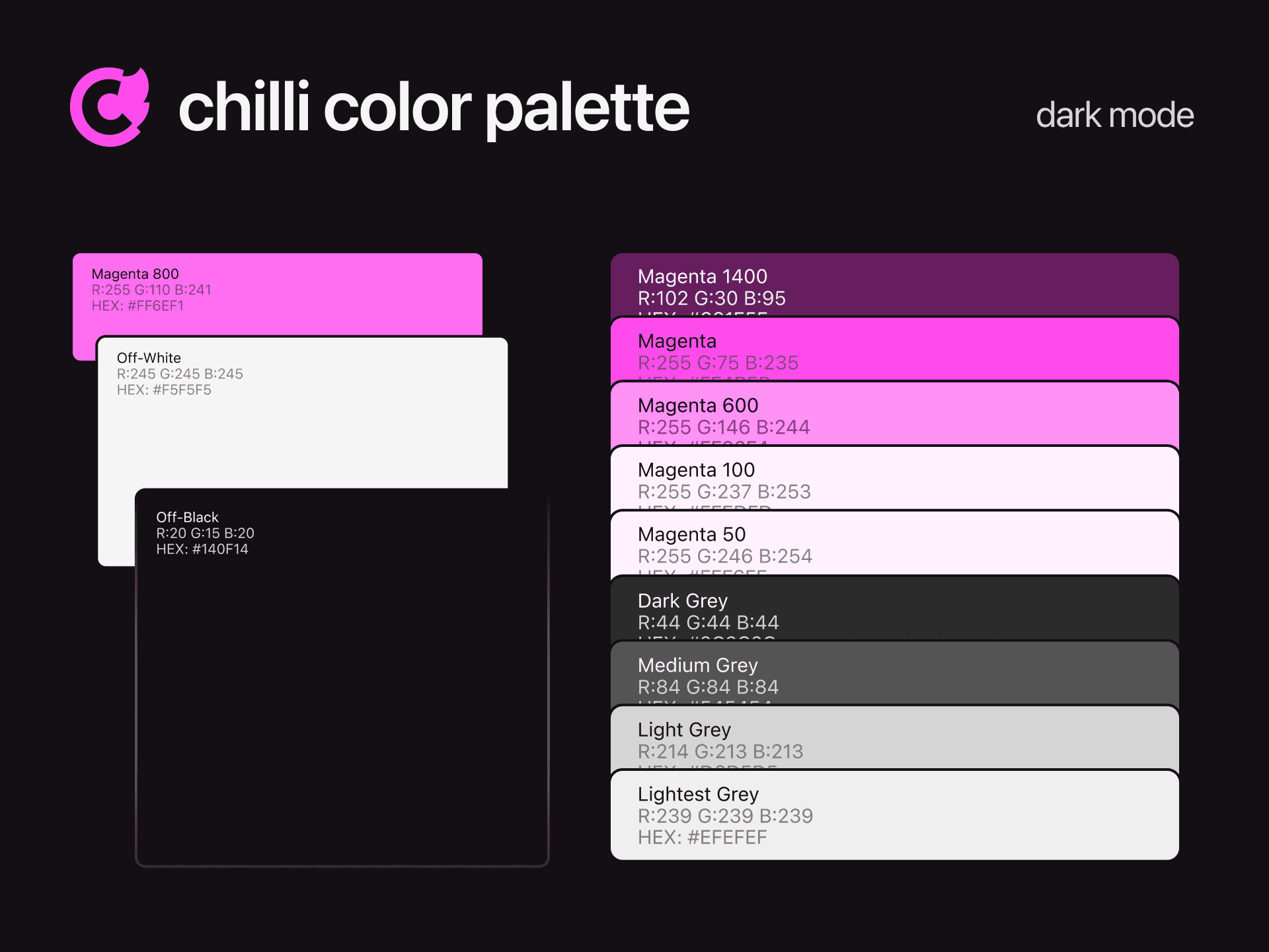
At the same time, I also designed the design system, which I updated as new designs came out.
Results
3 versions later…
In all, we've made 3 versions of the application, from endless streams of videos to a big button for taking action. Our understanding was refined, and in the end we understood what users wanted:
Take action in 5 minutes max
To feel important
Sense of urgency
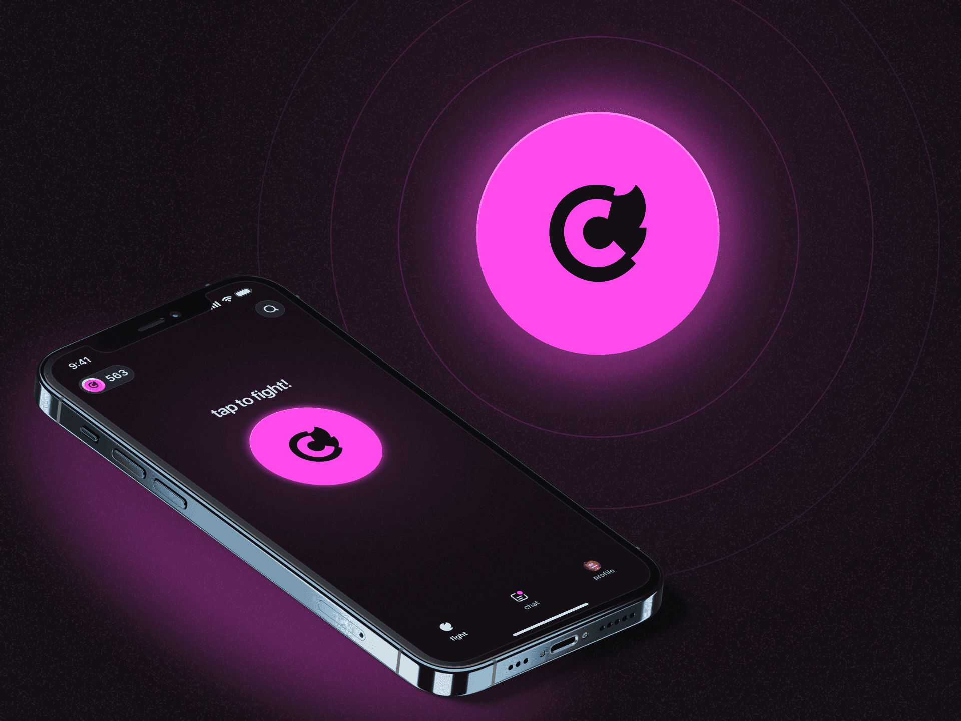
The Big red button feature
Simplifying a complex flow: that's the tough job of a product designer. In this new iteration, we decided to simplify the product as much as possible: less information for more action.
Metrics:
⭐ +500 unique users taking action per day (goal = 160)
✅ User-Friendly: Average usability score: 4.5/5. Clear app functions upon first use indicates excellent usability and user onboarding.
🌍 Belief in Impact: Average belief in digital actions: 4.3/5. Users are confident in the effectiveness of their digital activism, underscoring the app's persuasive design.
🔄 Eager to Stay and Share: The strong NPS (85) indicates users are not only satisfied but also actively promote the app, suggesting a high level of engagement and loyalty.